


Asda’s boldest own-label launch to date set out to replace Extra Special with a taste-driven premium tier designed for today’s mixed-basket shopper. Joe Wallis of OurCreative. takes us inside the two-year Exceptional project – and what it signals for FMCG leaders
Premium has always been a battleground in UK grocery. For supermarkets, own-label has become a statement of quality, trust, and aspiration, not just a functional alternative to brands. In 2025, that statement matters more than ever as consumers are mixing baskets with increasing fluidity. They’re saving on the basics, then reaching for something indulgent in the very same shop and that dynamic has created a race across supermarket tiers, from value to premium.
That was the context when ASDA made its boldest move yet. The challenge was to replace Extra Special, a range that had focused on ingredients but no longer matched shopper expectations. In its place, ASDA wanted to build something that felt indulgent, modern, and taste-driven. A premium tier that could reappraise the brand for quality and carry a quality perception halo effect across the store.
The result is Exceptional by ASDA, which comprises over 1,000 SKUs, developed in partnership with our team at OurCreative. The project touched so much more than just packaging, as it meant rethinking how premium can look on supermarket shelves, and it was all built around one deceptively simple question: what makes this product exceptional?
Brand strategy & vision
When ASDA came to us with the Exceptional brief, the ambition was clear: elevate perceptions of quality and set a new standard for own-label premium. At the time, the market was shifting fast. Premium own-label was growing as shoppers traded down from brands and out-of-home dining, and competitors were upping the ante with product quality (think wagyu beef and sourdough pizza bases).
Despite growth in Extra Special, ASDA wasn’t getting its fair share of the premium segment, or the recognition that comes with it. Research showed customers still questioned ASDA’s credibility in quality, even if they were loyal in value tiers. The supermarket had a quality perception problem, and premium had a crucial role to play in shifting that dial.
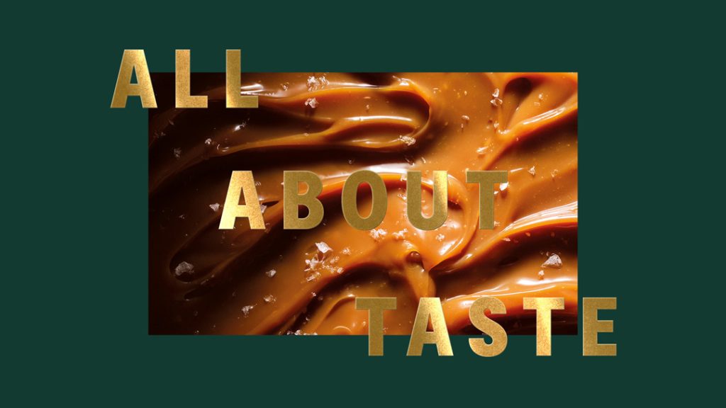
Exceptional was designed to fix that. Where Extra Special had been rooted in ingredients and provenance, the new brand would be all about taste with an emphasis on the full sensory experience of texture, indulgence, recipes, and methods. For me, that shift from provenance to pure taste was the breakthrough moment. It gave us a simple but powerful north star to steer every decision.
Strategically, Exceptional sits at the very top of ASDA’s tier ladder, with Just Essentials building trust at entry level and mid-tier covering practicality and everyday reliability. Exceptional had to showcase “the very best of ASDA” and, because most baskets are mixed, it had to feel aspirational without becoming elitist. It had to be a premium brand that shoppers could be proud to put on their table.
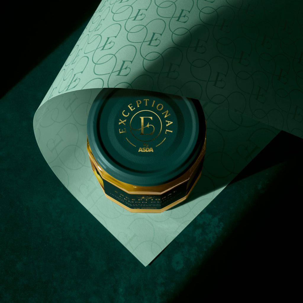
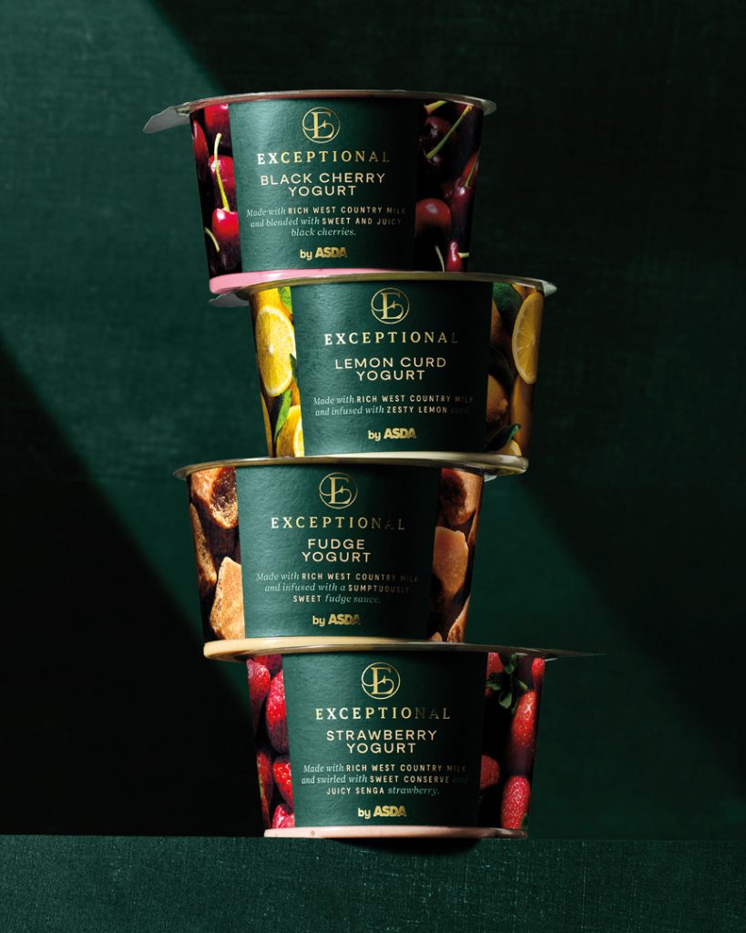
We worked closely with ASDA to define what “premium” should mean to customers today, which included an extensive audit of competitor tiers and a colour study to identify an ownable palette. Green has long been associated with heritage and elegance, but wasn’t being used at all in own-label premium, so naturally it emerged as the perfect choice, especially for ASDA. Paired with gold, it gave Exceptional a distinctive look that felt timeless yet modern.
Creative process & execution
Exceptional’s visual world didn’t emerge overnight. We tried everything from disruptive and unexpected to stripped-back minimalism, and our walls were covered in different creative routes. The design that stuck was the one that felt confident, elegant, and true to ASDA’s ambition.
Photography was where the biggest leap happened. Most own-label photography looks similar across tiers, with casual food-styling and graphics doing the premium work. We wanted Exceptional’s images to be instantly ownable and in line with the proposition “all about taste,” so we created a cinematic, almost architectural style. Using flags for sharp contrasting shadows, each shot draws the eye directly to the most indulgent detail – the food – with minimal propping and colours chosen to blend into the background so they didn’t distract from the food.
The identity system tied everything together. One of the key assets is the elegant and crafted serif ‘E’ monogram, serving as Exceptional’s stamp of quality. It’s versatile enough to work as a mark of approval, a repeat pattern for gifting, or a space-saving device on smaller packs. Typography was refined and consistent and every face of the pack told part of the product’s story, with romance copy written to stir the senses.
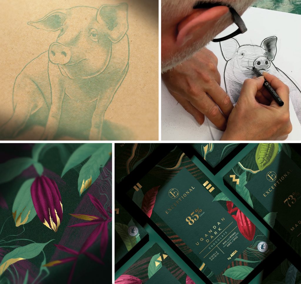
Illustration brought individuality across categories without losing consistency. Woodcuts for cheeses and charcuterie, botanical collages with pops of gold for chocolate and coffee and elegant line drawings – born from the monogram’s flourishes – for RTDs and giftables. All were hand-drawn by our in-house illustrator, ensuring craft and cohesion.
Behind the scenes, consistency across hundreds of SKUs was the biggest operational challenge, so our team leaned on years of experience running large-scale rebrands. At one point, our studio wall was floor-to-ceiling Exceptional packs, so you could literally walk the range and spot what sang and what needed tweaking. Guidelines were rigorous but flexible enough to allow for category nuance.
Collaboration was critical and we worked closely with ASDA’s print team to test how dramatic photography would reproduce across substrates. We also trained marketing teams to apply the identity in-store, and even shot the images for point of sale to maintain cinematic consistency. Every designer, artworker, and account manager in the studio touched the project at some stage. It was, quite literally, a full team effort.
Challenges and solutions
No project of this scale is ever smooth sailing and Exceptional was, well, no exception. The challenge was balancing consistency and individuality, as each category needed to feel distinct, but the family resemblance had to be unmistakable. Individual category briefs helped maintain nuance, while the brand system gave everything coherence.
Designing premium for a mass audience was another test. You have to remember this wasn’t luxury retail – it was supermarket own-label, which meant finding the sweet spot between aspiration and accessibility. Photography helped here because it allowed indulgence and drama to live alongside modernity across the brand.
Shelf clarity was also a constant consideration. With hundreds of products competing for attention, typography, layout and photography all had to deliver instant recognition.
Admittedly, over two years, keeping energy and creativity high demanded discipline. Regular wall-sessions, team check-ins, and cross-category comparisons ensured momentum never dipped. Certain categories stretched us further. Cheese gave us a few headaches, because it came with strict rules around logos and typography. The toolkit proved flexible enough to adapt without losing brand integrity.
Not every decision was straightforward either. Naming, for instance, is always highly subjective. Everyone has a favourite, which makes it one of the most passionately debated parts of any project. At one stage a different name was chosen for the brand, but trademark issues meant it had to change, which was a difficult but ultimately necessary call.
Another challenge was sequencing, as Christmas SKUs launched before the all-year-round range. The discipline was in ensuring they introduced the new brand rather than feeling like a separate festive look, unlike many established premium tiers. Only very subtle changes, like touches of gold propping in photography, were made, while the core graphical application stayed consistent.
![]()
What made the whole process smoother was the level of collaboration with ASDA. Rather than pushing back, the client was engaged and open. Extensive research and testing early on meant that decisions had confidence behind them.
Impact & Reception
Exceptional has been rolling out since Christmas 2024 and is now firmly part of ASDA’s core offer. For shoppers, it represents a new benchmark in own-label premium that’s indulgent, taste-driven, and unmistakably modern.
For ASDA, it strengthens the tiering ladder from Just Essentials through mid-tier to Exceptional at the very top. It’s a tool for reappraisal, showing that ASDA can do quality at scale while shifting perceptions in a way that benefits the whole portfolio.
Hearing ASDA teams describe the range as something they’re genuinely proud to see in stores has been one of the best bits for me. Teams across marketing, design and print have embraced the toolkit. For OurCreative., it’s been one of the studio’s proudest achievements and not just for the creative outcome, but for the collaborative process that made it possible.
External reception has also reinforced the brand’s positioning. Speaking to The Grocer, ASDA’s Chief Customer Officer David Hills described Exceptional as “a genuine step on in our premium offer,” while also underlining that it reflects “ASDA’s relentless focus on price.” He added: “The range is all about providing accessible indulgence. It’s food and drink that feels a little luxurious, but with the uncompromising value our customers expect from ASDA.”
That balance of indulgence without pretension and aspiration without alienation is what sets Exceptional apart, and why it already feels like a new benchmark for supermarket premium.
Closing reflections
For me, Exceptional proves that design isn’t decoration, it’s a lever for behaviour change, which is what I’ve always believed. Every detail, from the monogram to the copy, is built around one idea: All. About. Taste. That clarity has made the range both ownable and scalable.
I’m also personally proud of the standards we upheld throughout, as every pack feels considered. The photography is beautiful, dramatic, and almost cinematic. Most importantly, though, it’s ownable and unique to their brand, even when shot by different teams. The illustrations carry a level of craft rarely seen in own-label. Every single person in the studio left their fingerprints on this project and it was a real collaborative team effort throughout.
If FMCG leaders take away anything from this, it should be that design can change behaviour. It can reframe how a supermarket is perceived, and by extension, how consumers shop. Design alone isn’t enough, though, as it has to be underpinned by a great product and a strong strategy. Exceptional has both and that’s what makes it live up to its name.
Joe Wallis is the Design Director at OurCreative.

