
A culinary identity makes a brand recognisable as itself if the rules are followed consistently, writes Olaf van Gerwen
The neon coloured beanie has emerged as the latest craze among European millennials. To fully embrace your inner-hipster, pair it with a long sleeve adorned with Helvetica lettering, a fanny pack and a puffer jacket and you’re good to go. The similarity in attire becomes painfully clear in any Soho House. Whilst writing this I found myself eating guac smash toast in my black, belly-obscuring Carhartt sweater, sporting headphones and typing away on my Macbook – say, the universal code for any 40-50 year old creative business dude. I too look suspiciously much like my category. If I choose to stand out too much, I risk looking like an imbecile — there’s safety in conformity.
Back in the day when you, food & drink grand poobah’s and C-suite crawlers, were 15 years old, trends developed relatively slow. You probably took inspiration from people like Bowie, Gorbachev or McEnroe. Which were people everybody knew.
We had few TV channels, few crappy magazines and expensive albums to refer to. However, with the rise of the internet and the prevalence of connected devices, Gen Z has grown up in a world where every niche of culture has its own heroes and icons, unknown to the rest. For instance, the democratisation of music production has resulted in a plethora of sub-genres, each with its own set of stars and foes. There’s not only way more trends, they also follow each other much quicker. Building a stable identity is difficult when the sense of self is unstable. This presents similar issues for food and drink brands. But despite these challenges, there is hope.
THE POWER OF IDENTITIES
Identities lean on values and beliefs and help define ‘how you are identifiable’. While wearing a neon beanie in Soho House may signal that you belong to a certain group, it fails to highlight a unique personality. This may not be an issue for the average hipster or creative industry professional, but it poses a significant challenge for branding. A brand’s visual identity encompasses everything from the logo, colour palette, and typography to the layout. Expertly crafted by design agencies, these elements are documented in extensive guidelines that ensure consistency. Similarly, a sonic identity defines how a brand sounds. The power of detail makes a brand recognisable as itself if the rules are followed consistently. Brands are used to shaping identities and putting them to work in marketing communication.
DROWNING IN A SEA OF SAMENESS
Even though we as brand people like to believe otherwise, people don’t care much about brands. They are belly button fluff when compared to your kids, cute puppies, remote friends, amazing dance routines and Rihanna’s pregnancy. Additionally, competing brands and the people that bring them to market look at the same research, at the same need states, the same category entry points, the same moment of use and the same purchase funnel. On top of that, competing products often look similar: beer looks like beer and milk looks like milk. And on top of that, food products are mostly unbranded once removed from their packaging. By now you should be gasping for breath, dear food & drink Big Kahuna. Considering all of the above, it shall be no surprise that competing brands often look and feel the same in ads and content.

THEY HAVE TO KNOW IT’S YOU
As a craftsman I put to work the tools that work best to make a product look delicious: I design a shot and a movement, I choose a lens, an angle, a surface and a background. I light it, I prop it up and possibly use a hand model. Doing that day by day, I suddenly found myself filming the same beer swirl for the third time. Each time for a different beer brand. When I came close to shooting Similar Beer Swirl number four, I had a lightbulb moment. What would the shot look like if I was briefed on the brand’s vision, values and positioning, not just on the ad we’re filming? What choices would I make if I were told do refer to, for instance, heritage and nostalgia, rather than just ‘make it look delicious’?
I soon realised that in order to make a beer swirl ownable to a brand, I needed to have detailed information about what makes this brand stand out from others. Looking back at my work, I realised that this issue occurs frequently. Veeeeery frequently. For example, I shot a fried chicken burger for McDonald’s one day and a similar one for KFC the next. With a rough script, but without any specific brand guidance. I suddenly realised I had the power to determine the look and feel of the product and the shot. Detailed guidance on the brand would help create distinction. When unbriefed, it is guesswork, or luck.
THE UNLOCK MOMENT
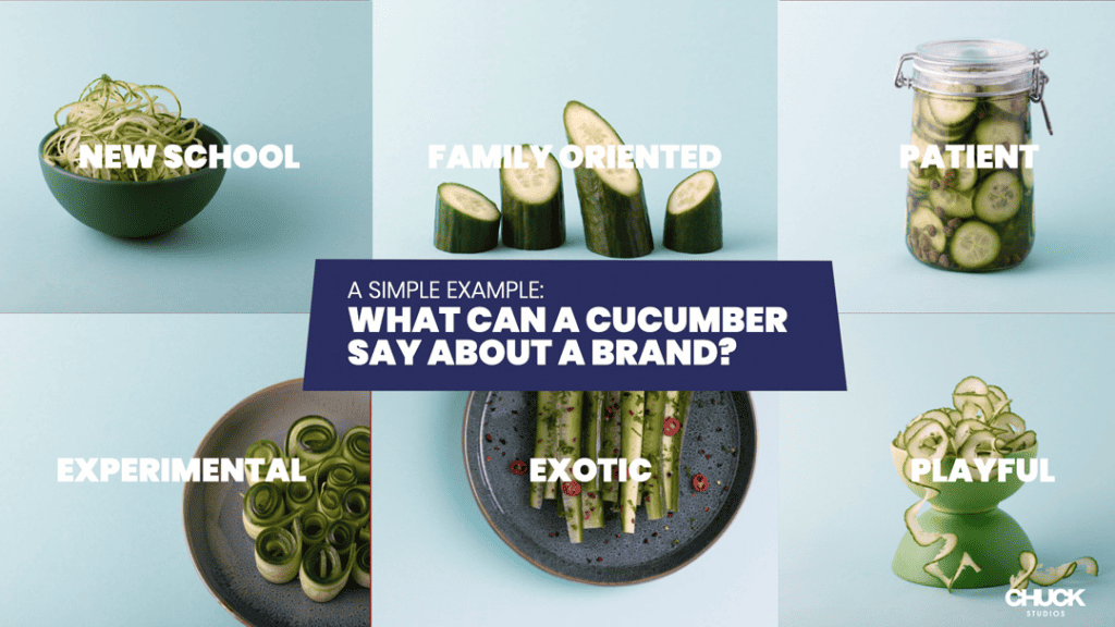
The concept of a Culinary Identity came to fruition when we realised that the same identity thinking used in branding can also be applied to product. By developing a Culinary Identity, we dictate how food is depicted, just as design agencies do for packaging and brand design. The product is often a brand’s sole reason for existence, its nucleus, so it makes all the sense in the world to codify how it looks. When should we show a pasta sauce? Is it during the harvesting of the tomatoes, the product’s purchase, when it’s opened, poured, mixed, stirred, served, or consumed? The answer depends on the brand’s positioning. We consider factors such as the surface it’s on, lighting, framing, movement, and even the choice of utensils. Just like in branding, the brand DNA should guide us in these decisions. Why leave such crucial decisions to chance, based on the food stylist’s whims, the prop master’s current interests, or the DOP’s latest passion for film noir? Brand marketers must take the lead and provide the necessary language to explain to creators the intricacies of how their food should look. Enter, the Culinary Identity.
DEVELOPING A CULINARY IDENTITIY
The Culinary Identity has been called a blind spot in food marketing. We get a lot of ‘why haven’t we been doing this for years already?’ and ‘now I have a problem I didn’t know existed’. Developing a Culinary Identity roughly follows the same steps as a design process. We immerse ourselves in the brand’s history, positioning, and DNA, and study category codes and the competitive landscape. The Culinary Identity doesn’t change a brand’s positioning or DNA; rather, it translates these attributes into the world of food. We do that with a core team of creatives and strategists but also food stylists, photographers and directors to ensure that the craft of making is at the core of the process.
![]()
If you’re a monobrand, it’s possible to design a brand device. A ‘thing’: a distinctive brand asset, or DBA. A DBA reminds buyers of the brand without mentioning the brand name. Arguably, the most famous DBA in food is the Nespresso droplet. Runner up is the lemon slice in a Corona bottle. We have designed a signature wave of foam for a beer brand and a signature bite for a cookie brand. We’ve designed a signature camera move for a QSR. We’ve designed a signature lighting style for a cheese brand.

If you’re a brand with multiple, different SKU’s, it’s likely to be impossible to design one DBA that works for all products. Often the answer lies in codifying the immediate surrounding of the product or looking at human interaction with the product. It leads to a combination of behaviours and choices that reveal a unique world. In that case, the creative style becomes a distinctive brand asset. Like in a Visual Identity, our Culinary Identity guidelines provide guidance on how to use them. Changing people’s behaviours and reflexes can be challenging so after the Culinary Identity is developed, we often help marketing teams implement it in to their processes.
MEANINGFULNESS VS SALIENCE
There is ongoing debate among marketing professors regarding the importance of the meaningfulness of distinctive brand assets. Modern opinions suggest that salience may be more crucial than meaningfulness. An example I like is the Gucci pattern. While a repetitive grid of lines and letters may not inherently symbolise luxury, by consistently using it and other brands copying it, it has become just that. Aldi’s Kevin the Carrot might as well have been Bob the Broccoli or Melvin the Mushroom. Yet, you can’t stretch it too far. Simon Shoepolish or Tina Toiletpaper would not have represented Aldi so eloquently. In the realm of food, meaningfulness can be particularly helpful because it allows us to identify unique traits whilst ensuring that the product looks both delicious and identifiable as its actual form.
THE TIKTOK TRAP
I remember donning a fanny pack gifted to me by a client and borrowing an orange beanie from my millennial colleague Natascha. Millennial Olaf quickly became the butt of the joke in our ‘office nonsense’ Slack channel. Trying to be something you’re not never ends well. As an example, brands brief us to adopt the style of TikTok, where young people express themselves through short videos. What you’ll get is a serious food brand that suddenly creates wacky videos with vegetables dancing in to the pot and finger-snapping transformations to trending music. It is already difficult to be recognisable to your audiences. Imagine how hard that gets if you constantly change the way you look and behave. Falling into the TikTok trap, or the equivalent of the next week, are distractions. It’s essential to care about how you look and behave and to know that those choices are rooted in the stable core of the brand to be less susceptible to such distractions.
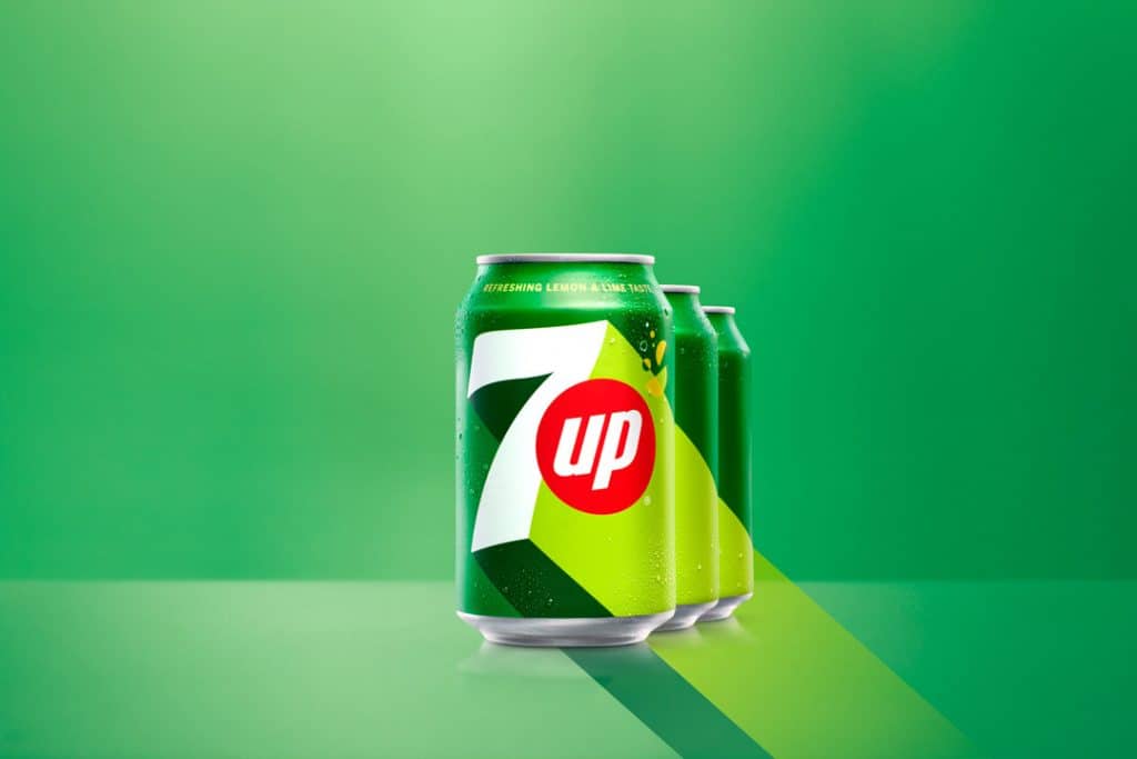
This isn’t to say that Culinary Identities don’t evolve. They most certainly do, just like visual identities. In the past few months, we’ve seen 7Up, Pepsi, Fanta, and Sprite reveal new visual identities. The bold and loud typography in these new designs aims to enhance readability on small screens, keeping up with shifting trends in media consumption. Identities should never change drastically – if Gothic Olaf were to show up in a client meeting, I’m pretty sure I’d be listening to men in white coats in a padded room soon.
BUILD MORE VALUABLE BRANDS
Creating a distinct identity takes time. Consistency and frequent exposure to audiences are essential conditions for success. The Coca-Cola Christmas truck for example has been around since 1995. CMO’s excel when their predecessors have left them with valuable brand assets. Unfortunately, the average CMO tenure is only 3.3 years, and marketing team members may have even shorter tenures. The choices we make, or fail to make, have long-term effects on our brands. Marketing sometimes gets a bad rep as a place where money is wasted instead of where value is created. Building a Culinary Identity for your food or drinks brand is not just the best hack in food and drink marketing; it also builds brand equity. In the best case, looking like your competitors will cost you a lot of money, and in the worst case, your brand risks drowning in the pitch black depths of a sea of sameness.
Unlike the average hipster or creative business owner in Soho House, you simply can’t afford to look like your category.
