
There’s a lot we can learn from 200 years of chocolate, writes Kristy Snell
This year marks the 200-year anniversary of Cadbury. This boast-worthy achievement, albeit impressive for any brand, is perhaps even more so for a chocolate brand. Falling into a category that relies heavily on certain codes and taste cues easily steers it into the dangerous world of sameness.
It’s unsurprising that so many chocolate brands choose to film their bar emerging out of a liquid pool of velvety chocolate. Our screens are filled with swirls, collisions and ribbons of liquid chocolate. The connotations surrounding chocolate almost dictate what we expect to see from a chocolate brand. So, what can we learn from two centuries of chocolate?
Shooting chocolate, however, comes with its own challenges. The physical restrictions that come with filming an opaque, dark, sticky liquid make it very difficult to get chocolate looking as luscious and glossy as we, and the brand, desire. At the same time, chocolate only looks good if you light it a certain way, and no one wants to look at a scratched bar or lumpy liquid chocolate. With these restrictions, many brands fall into the trap of requesting the same mood boards so getting the same results because we all know what (we think) works.
These limitations do not necessarily mean that a chocolate brand cannot establish an ownable Culinary Identity, one that positions your food as a distinctive and consistent brand asset. It just means that brands need to ensure the depiction of their product reflects the image they want to convey. Looking over the last 200 years of chocolate in advertising, there are brands that skilfully make the right choices, with Cadbury being one of them.
Building heritage
When it comes to the world of chocolate, history and storytelling are woven into its legacy. Records of chocolate date back over 5,000 years. In Aztec culture, cacao beans were considered more valuable than gold.
It’s a sentiment that is very clearly evident in the way Lindt depicts their chocolate. Aside from the use of gold, we see French-inspired chefs making the chocolate, everything from roasting the beans to tempering, relaying to audiences the skill and tradition behind chocolate making.
Not only is an expert making your chocolate, but he even has a specifically designed whisk to aid in reaching perfection. Using a chef, dressed in chef whites, goes beyond merely representing the maker, it also sends a message of the clean and elegant taste of their chocolate, codes that we often attribute to wine and whiskey.
By leaning into the artisan nature of chocolate making, Lindt positions itself very much as a chocolate to be savoured, and to borrow a phrase from the Aztecs, like a gift from the gods. It is no coincidence that we feel a bar or box of Lindt is an appropriate gift when wanting to show appreciation.
This is also evident with Ferrero Rocher. They too embrace notions of chocolate as a valuable gift. From the individually wrapped chocolate-nuggets to the gold dust particles that grace their ads, everything points towards the history of chocolate as a valuable commodity.

As a result, both Lindt and Ferrero use very traditional, elegant and sensational images to depict their chocolate. Something that works incredibly well for them. It might not necessarily be ground-breaking or even unique, but they know exactly who they are. One might argue that distinction is more valuable than sticking to something that works well, a concept that certainly rings true with smaller, less famous brands. When these brands choose the same codes that Lindt and Ferrero use they run the risk of disappearing into a pool of sameness.
What these brands should do instead of borrowing pre-used codes is show what makes them unique. A great example of a chocolate brand knowing exactly who they are and showing it in their food depiction is Reese’s. Those delicious cups of peanut joy do not make use of traditional chocolate visuals. Instead they opt for very stylised, graphic and playful ways to advertise these tasty treats. Set against a backdrop of solid orange, the peanut cups appear cartoonish in size. Adding to the playful nature of the cups, we see the brand utilising the quirky film technique of stop motion. They also often oscillate between CGI and in-camera shots. This blending creates a unique aesthetic which both adults and children alike can relate to.
Chocolate works a treat
What stands out when we buy chocolate as opposed to other food and drink transactions, is the often emotional connection between the chocolate and the buyer or recipient. Buyers consider its purpose, as well as the feeling and sentiment it carries. And brands should too.
Our brains are hardwired to compute emotions and stories better than data. Translating a chocolate brand’s story into a distinct brand identity can be what stands between provoking an emotional connection and indirectly creating a disconnect. A simple chunk can give us a few moments of bliss and serenity, soothing us in the rush of modern life. It can also be both a celebration or consolation. Want to say ‘I love you’ or ‘I’m sorry’? Chocolate works a treat.
A brand that beautifully portrays this is Cadbury. They opt to show less of the chocolate itself and more of the story behind buying, say, a bar of Dairy Milk, using the age-old tactic of prompting nostalgia to win the hearts and minds of ever-flighty consumers. Chocolate, by nature, is sociable. We talk about our love for it whatever age we are. We smile as we know it’s a treat. We share it. And this ageless attitude towards it all allows for greater emotional storytelling.
In its most recent and timeless 200th anniversary advert, highlighting the love between a mother and her daughter, Cadbury capitalised on the opportunity to do just this. By recreating one of their sweetest ads, now shown unfolding over two-hundred years, they illustrate that the feeling of giving never changes, just like their bar. As an audience we very quickly draw the connection between a simple act of kindness and giving a bar of chocolate. Simple, yet impactful.
It’s in the execution and small details where the power lies. The back-and-forth exchange between the shopkeeper and little girl has a tongue-in-cheek serious tone, removing any saccharine sentiments, natural-like lighting grounds it in reality and the subtle hint of purple subliminally hints towards the brand. By the time the little girl hands her unicorn over we are *cue tissues* just about finished. Reminding the audience, young and old, of a universal truth: that giving up something to make another happy is worth…all the unicorns in the world. Like Lindt and Ferrero, Cadbury also leans into the notion of chocolate as a valuable commodity, a worthy gift. But they choose to depict the same “gift from the gods” in a totally different manner.
With a legacy of showcasing the humbling and real stories behind its customers, Cadbury proves that one does not need to see swirls of molten chocolate in order to create crave-ability. On the flipside, however, it does also beg the question whether Cadbury would benefit from adding emotional storytelling techniques to traditional chocolate shots.
It’s all in the bar
As a relative newbie to grace the chocolate aisle, Tony’s Chocolonely was built on a legacy of fighting for a slave-free chocolate industry. For the past 13 years, the brand has become bolder and braver in delivering this ambition, stopping just shy of directly naming the guiltiest of the chocolatiers.
Heritage, or a legacy, is not always necessary to stand out. There are, after all, always going to be newer kids on the block; mavericks setting a new bar.
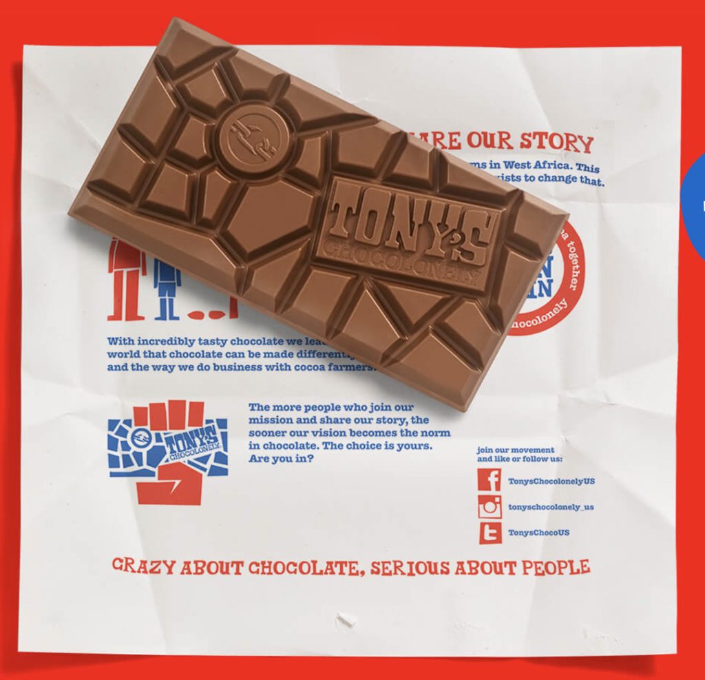
Breaking many traditional standards, with activism at its core, Tony’s ensures its values are never compromised to ‘fit in’ with its category. Prevalent across its packaging and products, its principles are placed above even the eating experience. Opting for a disjointed-shaped bar, designed to be a difficult experience for consumers, Tony’s sets itself apart on purpose, to highlight the hardship that goes into creating every bar of chocolate. Their values are reflected across every brand touchpoint and remain at the forefront of our association with them as they continue to provoke and challenge the status quo.
A similar tactic, yet with a different goal, is used by Milka.

Focusing on the sentiment behind the word ‘tender’ they designed a relatively flat bar with soft, rounded corners that, once popped in your mouth, will effortlessly, softly, tenderly melt away. Like Tony’s, the brand’s values filter right through to the eating experience.
Talking about melt-ability, Kinder Bueno, from Ferrero, wraps each finger in a thin film of plastic preventing your fingers from getting covered in chocolate. With a slightly higher price-tag than your average candy bar, this excess of plastic, which prevents sticky fingers, creates a more sophisticated eating experience. In their adverts we notice other mechanisms that point towards sophistication; soft lighting, gentle camera movements and the meticulous attention placed on building the bar.

Going a step further, Kinder Bueno (above) chooses to display the bar floating in the air. This seemingly insignificant detail in fact signals to the consumer how light the bar is. This is unlike a Snickers bar which is often depicted from grounded within a heroic angle, shot using a wide-angle lens, suggesting it is a weighty, chunky, meal-of-a-chocolate. From these examples we see how important it is to fully understand what your brand represents or what you want people to associate with it when it comes to its depiction.
Staying afloat
Whether you’re a classic brand, a new kid on the block, family, playful or exotic, food is the instrument you as a marketer can use to craft a specific, unique and distinguishable Culinary Identity that is always anchored in your authentic values.
This is what will set you apart from competitors. This will be the lifejacket your brand needs to help it not only stay afloat in the sea of sameness but to also choose a different route.
Kristy Snell is the Creative Director at Chuck Studios

