

Crafting a compelling on-pack character takes precision. Here, creative agency LOVE reveals how Sol’s signature brand beacon was refined, road-tested and reborn for today’s consumer
Characters and faces have historically been used by brands to great effect. The likes of KFC’s Colonel Sanders, the Quaker Oats smiling face, or Pringles’ Mr P work with other brand assets to offer different expressions of personality, both on and off-pack.
Including a face on packaging is a great way of helping a product stand out on a busy shelf, as our brains are naturally wired to recognise faces instantly, even in crowded visual environments. It also enhances expression, allowing brands to communicate emotion, warmth, happiness, trust or excitement that consumers subconsciously transfer to the product.
Faces work especially well in categories where emotion, approachability or a sense of personality can drive consumer choice. This is why we have recently seen a resurgence of mascots and illustrated faces in branding – think of the friendly tech brands using facial features to create warmth and memorability in increasingly crowded markets (such as unicorn insurance company Marshmallow).
But for all the advantages, using faces in brand can also have its challenges. Responses to faces are always more personal. People all have different unconscious biases and beauty standards, so someone’s welcoming smile might be someone else’s frightening grimace.
A valuable asset
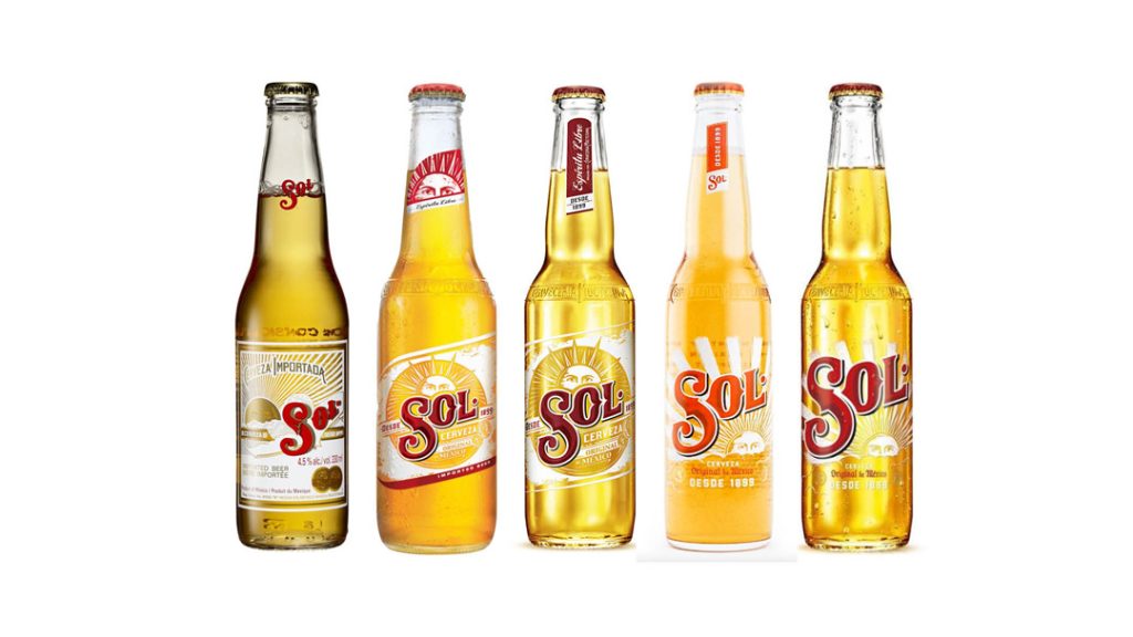
The team at creative agency LOVE faced this challenge when it worked on the identity refresh for iconic Mexican beer Sol. The redesign aimed to position it as the beer of choice with young adult consumers and re-establish its status as ‘the original’ through craft and premiumisation.
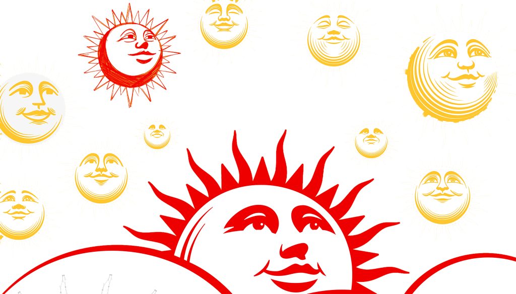
Among the brand’s core assets was a ‘sun face’. It had been used for decades, but many previous creative expressions had struggled to make the most of it.
Nonetheless, it was clear from the start that the sun face was crucial to Sol’s identity, as it was the brand’s most distinctive and historically resonant asset, said Eve Warren, Design Director at LOVE. “The idea of the ‘Mexican sun’ draws from deep cultural meaning – from the significance of the sun across Mexican cultures, to deities such as Huitzilopochtli which associate sun with life, energy and power. So, it was important to get this part of the design right.”
From mascots to brand beacons
For Sol, the sun was never intended as a character or mascot, added Warren. Some brands use faces in intentionally characterful ways that carry a strong sense of personality, warmth and approachability. For example, the LOVE team looked at other sun-based identities, like Top of the Mornin’ Coffee, where the sun plays a central and expressive role within the brand, taking on more of a role of a mascot.
“However, this approach is very different from how we treated Sol,” explained Warren. “For Sol, the sun wouldn’t work as a character or a ‘personality’ that talked to the consumer. For starters, it would be problematic for an alcohol brand to feature an overtly friendly and encouraging character that could be seen to encourage drinking. Instead, its role needed to remain symbolic and culturally grounded – acting more as a brand beacon rooted in traditional Mexican iconography.”
Such brand beacons in packaging can play a very effective role, emphasising a sense of modern heritage. The Starbucks siren acts as a powerful brand beacon, not as a mascot, but as a heritage symbol rooted in the brand’s maritime origins and early positioning around exploration and global coffee discovery. She functions as a distinctive visual asset that remains instantly recognisable, even without the Starbucks name, and her evolution over time has balanced simplification with iconic consistency.
The Sol sun face had the potential to play an equally valuable role – to act as a motif that could unify the entire identity system across packaging, communications and digital touchpoints. With the strategic aim to strengthen Sol’s authenticity and modern relevance while staying true to its heritage, the sun stood as a symbol of optimism and energy, qualities that aligned directly with Sol’s positioning.
The nuances of facial features
While the Starbucks Siren never speaks or plays a narrative role, the siren provides an emotional cue, signalling comfort, ritual, and a familiar premium experience. Her strength lies not in characterisation, but in symbolism: a timeless emblem of origin, meaning, and brand memory.
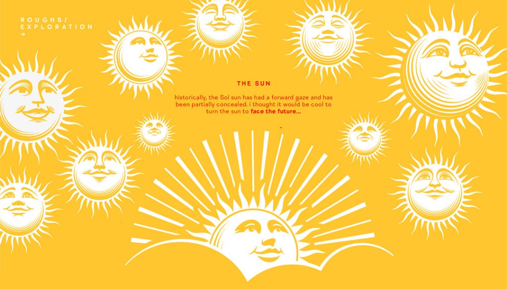
Getting the human face of Sol’s sun right – to elevate it from a merely functional backdrop to an icon enriched with deeper storytelling – presented another layer of complexity. “The fact that it was a human face meant its expression was highly subjective and required multiple rounds of design and consumer testing,” said Warren. “We worked closely with illustrator Tobias Hall, exploring how to bring this symbol to life in a way that felt optimistic and future-facing, yet still timeless. Balancing authenticity, clarity and universal appeal needed careful iteration and considered craftsmanship.”
LOVE had access to a wealth of brand archive material, a treasure trove of labels, faded signage and campaigns full of intricate detail that gave a valuable insight into the brand’s origins. But the task was far more complex than simply reviving old label designs. “Sol has grown significantly since the early 1900s,” said Warren, “with new commercial expectations and a broad international audience, so the heritage cues needed to be reinterpreted with sophistication and purpose.”
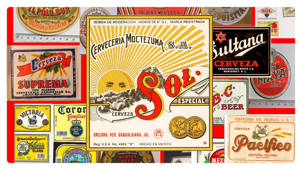
The design team also took inspiration from other reference points, like the visual language of Lotería, a traditional Mexican game, where the ‘El Sol’ card offers a simple but powerful expression of this cultural symbol that becomes a meaningful marker of origin and optimism – similar to what the rebrand wanted to achieve.
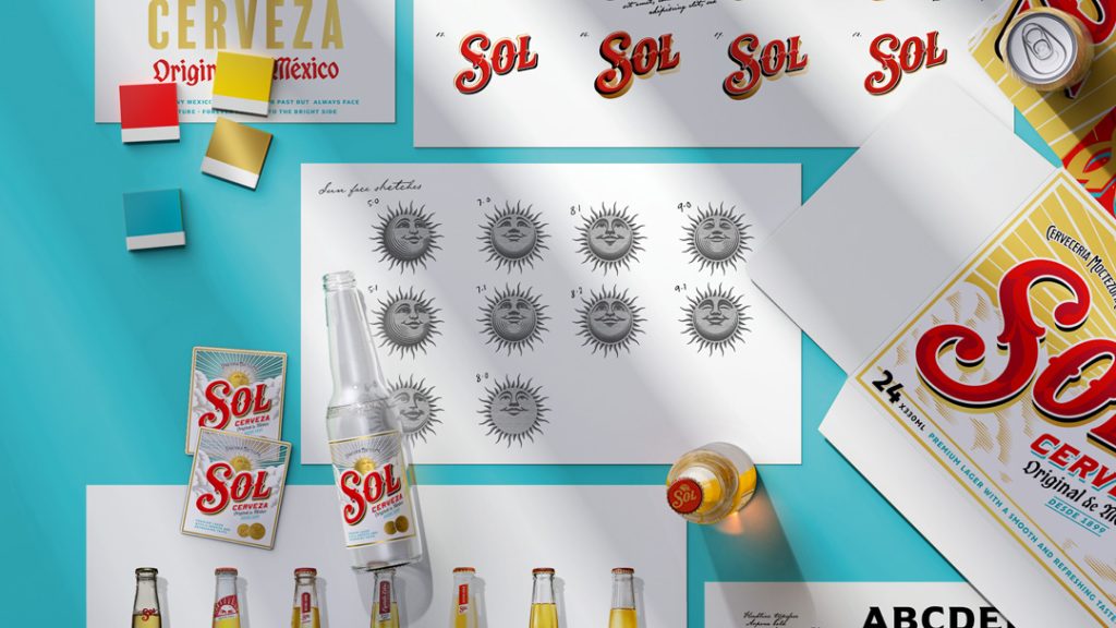
The design of the sun face went through more than 50 variations to get right. Some earlier versions felt too uncanny, too disconcerting, even ‘too round’. The breakthrough came when Hall rotated the face – the final design now sits proud, showing its full face for the first time, with an open, upward gaze toward a bright future.
Looking to the past to create something new
Such level of care and craftsmanship is crucial when looking to modernise a brand, believes Warren, especially if looking to appeal to the young adult consumer that expects brands to be authentic, culturally relevant and visually compelling. Dialling up heritage, but presenting it in a fresh, modern and more premium way taps into this younger consumers’ appreciation of ‘newstalgia’ – using the past to inspire something new.
“There have been a lot of brands recently that have gone back in time – Burger King, the Co-op,” pondered Warren. “But while many went back to their old logo, we have taken references from old labels and logos and have created a hybrid from the old and the new.”
This approach of looking in the past to influence something fresh runs through the entire brand refresh and new Sol identity. For example, the energy of the vibrant colour of Mexican art, clothing and festivals inspired a new brand colour palette and art direction. The new palette dials up Sol’s iconic red and gold, while introducing teal to represent a crisp, clear blue sky and the liquid’s freshness. It now more effectively reflects a brand that was born from a culture synonymous with bold, vibrant colour, while delivering a more high-end feel.
Hand-painted Mexican signwriting inspired the bespoke typographic elements, while Sol’s historic labels guided the characterful, imperfect style of the wordmark. One of the key opportunities was re-establishing the relationship between the wordmark and the sun icon, which had become visually disconnected over time. To restore that harmony, LOVE brought the two elements back together –heroing the wordmark beneath the sun and tucking it into the surrounding cloud forms – creating a unified and more cohesive central mark that feels both authentic and iconic.
The biggest learning from the project was the importance of close collaboration, said Warren, especially given its cultural significance. “With multiple stakeholders involved, clarity in briefing and alignment on intent were essential. Working with an artist like Hall made the process smoother. Because he specialises in modern heritage brands, he understood from the outset that this was not about imposing a personal style or creating a character with free rein.”
Designing facial features for packaging demands a careful balance, she added. “A face can quickly become overly expressive, stylised or character-like, which risks undermining authenticity, especially in categories like alcohol where cues of heritage and provenance matter.”
With so much at stake, is it worth experimenting with faces when it’s such a challenge? The Sol refresh shows that getting it right can give you a natural and powerful expression of the brand’s essence. As Warren puts it: “At a time when many alcohol brands lean heavily on generic craft cues, the sun gives Sol a uniquely ownable point of difference, something that no competitor could replicate.” If a brand is able to put its best face forward, it could become its most valuable asset.
