

")
Olaf van Gerwen lifts the foil on how Chuck Studios reimagined this iconic chocolate brand’s identity – chunk by glorious chunk
Speak to anyone from the Netherlands and they’ll tell you the story of Tony’s Chocolonely, such is the way the brand is ingrained in public consciousness. For those that don’t know, the journey began more than 20 years ago when Teun van de Keuken – a journalist renowned for his investigation of food production methods – became aware of the cocoa industry’s rampant inequality.
For three years, van de Keuken sought to use his documentary series to draw attention to the global issue, to no avail. Recognising that a strategy change was required to move the needle, he opted to create his own chocolate brand. And so, Tony’s was born.
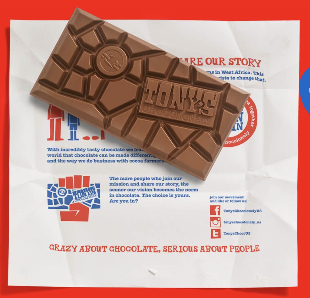
This wasn’t a commercial project aimed at carving out a slice of a competitive yet lucrative market. Rather, it was a physical representation of van de Keuken’s mission to end exploitation in the cocoa industry. It’s this transparency and activism that made it all the more satisfying to have the opportunity to collaborate with Tony’s.
The brand’s narrative, and the sympathy it generated, meant that it had no trouble achieving cut-through in the Netherlands. However, its reach paled in significance to global brands such as Cadbury and Milka. To complicate matters further, Tony’s lacked the necessary budget to produce large-scale marketing activations to put it on the map.
A peek at the secret ingredients
When it comes to the world of chocolate, the reasons behind consumer purchases are seemingly endless. It’s a reward, it’s a source of consolation, it’s a form of escapism. But there’s one motivation that trumps all: taste!
This is the message that we needed to bring to the masses. However, while advertising technology has come a long way – look at Billie’s scratch-and-sniff billboards – we’ve yet to unearth a tool that can remotely translate a product’s deliciousness.
For us, the challenge was clear: find a way to unleash the taste and flavour of Tony’s in a distinct and meaningful way.
The process began by conducting a thorough analysis of the market. By scouring through other brands’ identities and campaigns, we identified some 30+ tropes that frequently cropped up in chocolate ads – these range from manipulating the chocolate so that it waves and ripples, to loading shots (an industry term used for when a usually female model takes a sensual bite out of a product).
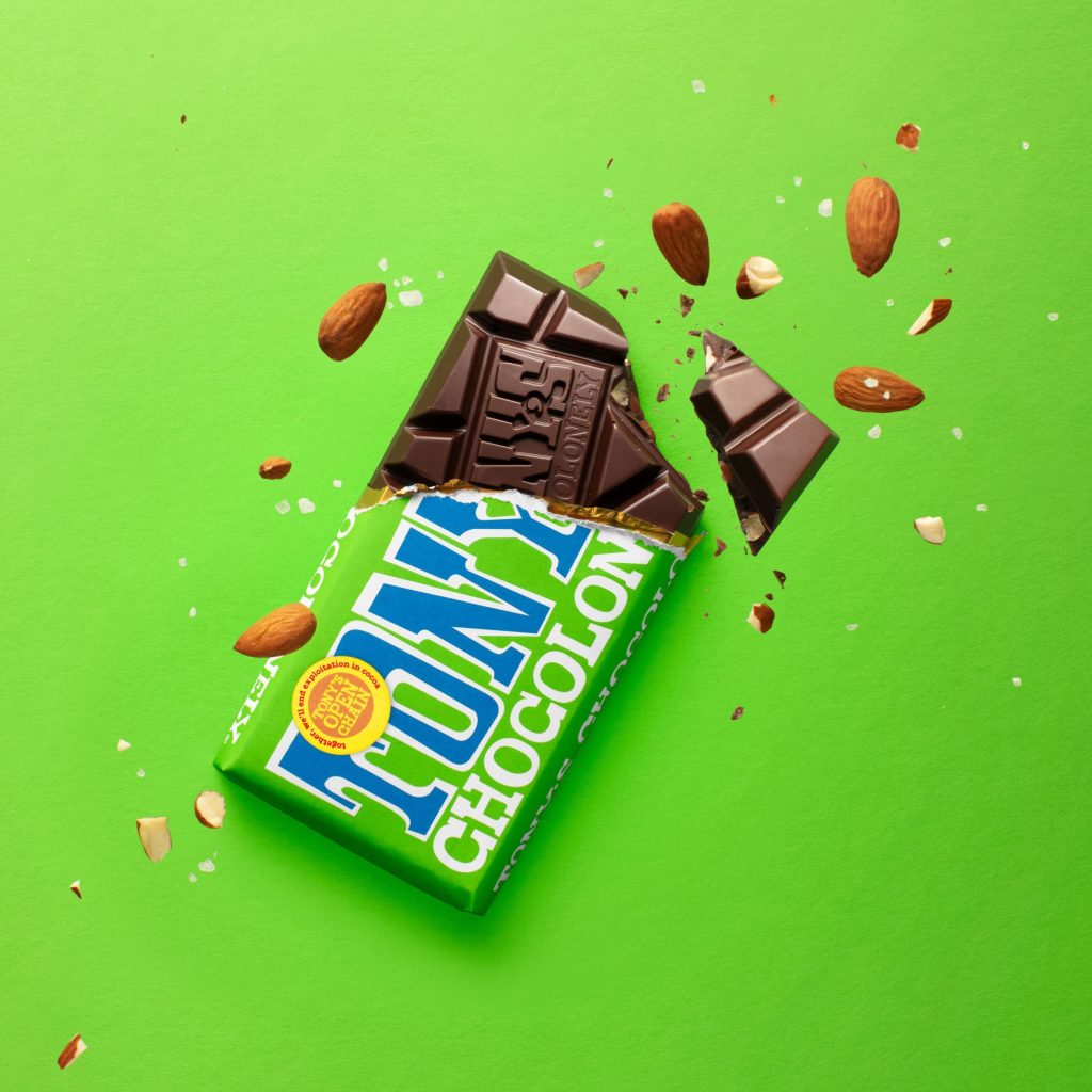
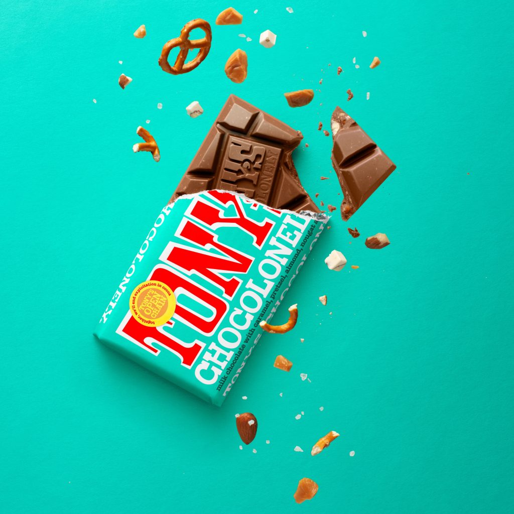
Putting these insights into our back pocket, we turned our attention to Tony’s – what made its bars unique? Strategic analysis revealed that it was the bar’s thickness that stood it apart from the crowd. Rather than being smooth, you need to exert real effort to break or bite through. It’s not delicate or tender, like some other industry favourites. It’s chunky – and that was the image we wanted to hone in on.
Next, we had to determine the category codes that would bring this chunkiness to life on-screen. Thankfully, this is where observing consumer behaviours paid dividends. Specifically, our own.
It didn’t matter if I was sharing the bar with someone else, or enjoying it as a personal treat – whenever I peeled back the wrapper, I couldn’t help myself from snapping off the first two chunks. After taking this theory to the public, the same held true.
Thanks to my own chocolate addiction, we had our stars of the show: those two bits that come off begging to be eaten. We aptly nicknamed these “Neil”, after Neil Armstrong, the first man on the moon – and someone not afraid to take bold strides into the unknown. This decision also led to the next step in the process: devising how we released the chocolate from the wrapper.
From Ground Control, we established a set of rules that would anchor the brand’s visual representation. These ‘taste codes’ included:
- The ‘Golden Ratio’ – a one-third-two-thirds rule about showing the bar unwrapped
- The ‘Balancing Bar’ – a unique angle for the bar the appear, rooted in other brand design truths of Tony’s
- Colour coding
- Inclusions
- Paper background
Together, these codes answered the brief – provide Tony’s with a strong, memorable culinary identity. Whether it was consistently portraying bars at a 66° angle or staying true to a two-to-one wrapper-to-chocolate ratio (ensuring shoppers could clearly see a few chunks as well as a clear logo) – this signature look ensured every asset was unmistakably Tony’s.
The final piece of the puzzle was to actually shoot the creative shots. Some would have leaned on CGI and AI for this process, but we felt that using analogue techniques was definitely more in line with Tony’s brand DNA. Aside from cleaning up a few rigs and shadows, every aspect of the images were shot in camera using the same technology Walt Disney used to make Bambi famous. This was the key to unlocking a clear, distinct, visual language that would translate around the world.
The brand that melts in your mouth
Typically, activist brands have a founder or brand guardian that can be very risk-averse. They’re protective over their concept, and aren’t particularly open to the idea of embracing marketing tactics that are known to just work. Unfortunately, this can cause the brand to miss out on opportunities to evolve and progress.
In this regard, as in many others, Tony’s is the exception to the rule. Not only does the brand possess professionalism across the entire C-suite; its decision-makers understand that it being an effective vehicle for meaningful change works better if you’re big: more chocolate sold means that more impact is made.
I want to leave you with a story that demonstrates this philosophy in practice. After our first project briefing meeting, the Tony’s team invited me to visit “The Vault” – and when I stepped in, I immediately gathered how it had earned its name. Shelf after shelf, row upon row, full of pure chocolatey goodness. Bars, mini bars, Tiny Tony’s, Mini’s, the works. I was the literal kid in a candy shop – something I didn’t take for granted, taking the opportunity to fill a paper bag with as many bars as possible.
Returning to the office, I scattered the bars across the table and watched as my team descended like a pack of vultures. This was how much they loved the chocolate – and this was the feeling that we were trying to replicate across the world. Neil will help us unlock not only brand fame, but also product fame. And that’s because of how delicious it is.
Olaf is the founder and Global Creative Director at Chuck Studios. He has directed and shot over 600 TV commercials in 30+ countries. Together with his team, he helps food brands around the globe develop a distinct culinary identity.

