


Fredrik Svalstedt discusses the evolution of premium packaging and what it means for brands today
Despite economic uncertainty, many consumers are still happy to pay for moments of indulgence.
A recent Euromonitor study found that globally, people are often choosing to spend their money rather than save. It’s why so many FMCG brand owners look at premiumisation as a commercial driver. Premium is where people are prepared to pay more – in fact, it’s the tier that sees some of the most successful brand launches within FMCG (Kantar).
Whether you’re selling coffee, confectionery or cleaning sprays, going premium can be a powerful differentiator – but only if you understand what your audience is looking for and how the expression of ‘premium’ itself has evolved.
What was once an adjective closely linked to luxury, has today taken on a much broader meaning. With consumers using brands to project their values, personality or culture, premium now goes beyond exclusivity and ‘bling’. It’s about sparking emotion, creating connections, and offering those small, delightful surprises that make someone say, “I want this in my life”.
So, your brand expression of premium needs nuance – and it all starts with your packaging. Here’s how to get it right…
Embracing a broader palette
From a design point of view, premium is no longer about exclusivity and costly finishes (black, gold foil, expensive paper stock). It’s about multidimensional visual cues that can signal anything from joy to nostalgia, from a challenger attitude to passion and craft.
For FMCG brands, this means a much more thoughtful approach. If you execute premium on autopilot for your new product or range, relying solely on conventional cues, you’re likely to miss the mark. Instead, you need the ambition to offer that ‘little extra’, a new experience, some added value or opportunities for self-expression. You need to show people that you want to add something to their lives – this is what should drive your visual expression.
Start with the audience
The best approach is to start with your audience. What drives them? What emotions do they want to feel? Some might choose a product because it reassures them that they’ve taken a responsible decision. Others might just want to indulge in superior taste experience. Drivers could also include a thirst for knowledge or disruptive ideas, a yearning for heritage and trust, or a way of expressing a unique interest or mindset.
Once you have identified that ambition and the human insights that apply to your brand, you can draw on a much broader palette to create a bespoke notion of premium that really connects. You can turn your packaging into a true driver for your brand.
- Indulgence through detail
Let’s take indulgence, for example. If your brand is about superior taste, you can explore imagery that heightens the sensory. Ice cream brand Sammontana’s photography for its Gruvi product is a particularly enticing example. Or play around with naming and copy. For example, lifestyle brand & Other Stories’ soap bar uses words on pack, “Vivid orange blossom tinged with coriander”, to tell a more engaging story.
- The human touch for passion and craft
If your audience is passionate about craft and hyperlocal and wants their brands to reflect this, you might use little details to denote a more small-scale proposition. A hand-applied sticker, say, or on-pack storytelling talking about people, personality or place. In our work for Malmö Chocolate Factory, we explored the next level of premium in chocolate, designing a heightened unwrapping experience. It included design cues and an illustrated narrative that highlighted the bean-to-bar process, origin and craft that goes into every product.


- Fuss-free design for honesty
Meanwhile, a consumer that values honesty in an increasingly uncertain world might appreciate unfussy visuals or clear depictions of ingredients. Swee Kombucha, for example, denotes each of its flavours’ ingredients through a clean and visually pleasing colour-coded graphic. Brands like Kiehl’s and Aesop, on the other hand, draw on heritage and clear information on pack to underline their knowledge and expertise.
- Heritage to evoke trust
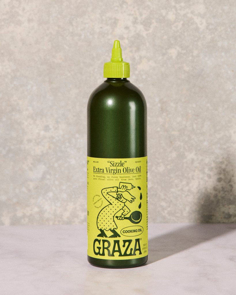
The recent ‘old/new’ trend that draws its strength from nostalgia, meanwhile, shows how brands can create expressions that feel both modern and rooted in history. Often combining a design aesthetic of the past decades with bold typography and desaturated colours, they evoke a sense of familiarity and trust. GRAZA olive oil, for example, signals high quality in this way on its innovative squeezy bottles.
Maintaining your focus
The possibilities are endless and exciting. But with such a broad palette to draw on, it’s crucial to maintain focus. Brands have the chance to tell a compelling story with their design, but they need to decide exactly what they want to communicate.
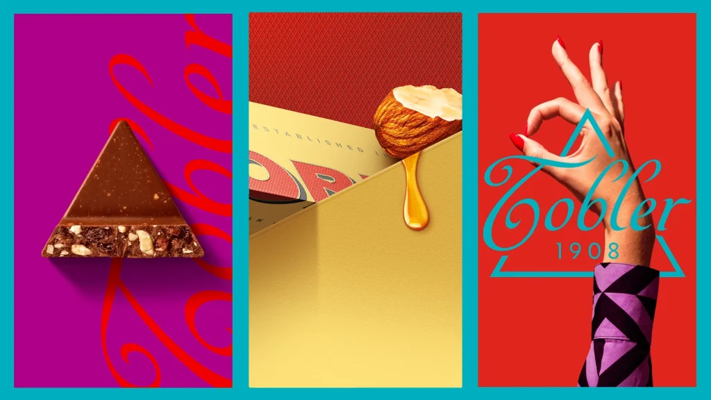
For instance, Toblerone’s recent rebrand uses colour, bold imagery and shapes to underline its message of daring to ‘be more triangle’ in a world of squares.
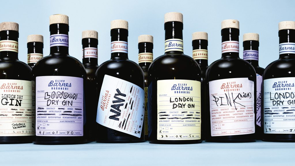
In our work for Cliff Barnes Distillery, meanwhile, we wanted to highlight the gin brand’s attitude and cult status, so we ditched the usual cues of heritage and exaggerated craft in favour of an authentic and offbeat design.
Subverting expectations
Thinking of premium in this way can also help forward-thinking brands tackle wider challenges such as sustainability. We are already seeing some high-end spirits turning away from heavy glass bottles in favour of delicate, vase-like vessels. Absolut Vodka, meanwhile, questioned perception of premium sustainability with its paper bottle a few years ago. A new sustainable premium packaging format that is truly easy to relate to and interact with could create a significant shift within FMCG in the future.
This is why packaging is so important – why it needs to be at the heart of your brand strategy. It is the ultimate expression of your ambition. If you embrace nuance, emotion and a multidimensional approach, it can make your proposition and value that more relevant and engaging.
Fredrik Svalstedt is the COO & Partner at Pond Design

