


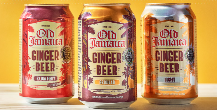
Old Jamaica has returned to shelves with a fresh new look, marking a major visual overhaul for the UK’s best-known ginger beer. The updated identity, developed by social-first agency SAMY Alliance, is designed to appeal to a younger audience while preserving the brand’s Caribbean heritage.
The redesign introduces six vibrant new colourways, replacing the brand’s former palette of browns and reds. The refreshed cans are intended to reflect Old Jamaica’s bold flavour profile and bring greater standout on shelf, in line with a wider relaunch campaign running across social and digital platforms through summer.
The brand’s long-standing palm-fringed beach theme (below) has been retired after 35 years.
In its place is a modern, stylised palm icon—simple, clean and intended as a recognisable shorthand for the brand. The logo has also been reimagined, with the traditional Old English typeface making way for a streamlined, contemporary design that retains a subtle nod to the original.
Typography across the range has been standardised using Brule Bold for headlines and Cera Pro Black for supporting text, bringing greater clarity and cohesion to the overall design.
“The Caribbean is one of the most visually rich cultures on the planet, and its tones are infinite,” said Hernán Cerdeiro, SAMY Alliance CCO Americas and campaign lead. “Our new vibrant colour combinations aim to transport consumers to a world that is colourful, festive, and full of flavour.”
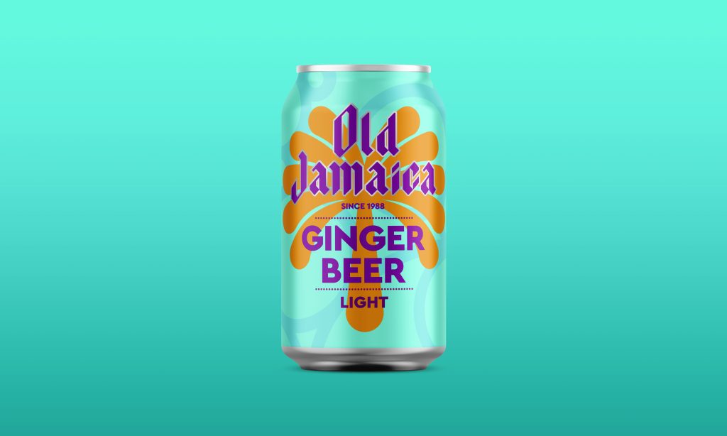
Alfonso Haces, Senior Global Marketing Head at Beliv Company, added: “SAMY Alliance has delivered a standout new brand identity that gives Old Jamaica a bold, modern presence. The reimagined palm icon is a strong symbol for the brand and one that will become increasingly visible as we roll out new activations throughout the year.”
